More than Millwork: Capturing Legacy and Craftsmanship at Woodhaven’s Lumberyard
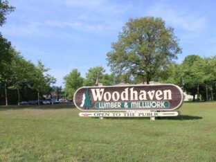
Splendor’s team recently visited Woodhaven’s lumberyard in Lakewood, New Jersey to document the magnitude of this 44-acre multifaceted operation.
read moreTypography is the art of arranging letters and words – a.k.a – “type” within a design or presentation. From a graphic design perspective (in our universe), typography involves not only color, size, and positioning of typographic elements, but also the very design of the letters themselves.
A typeface is a grouping of characters created with the same design scheme or style. For the layman or amateur user of type, “whatever Microsoft Word’s font menu includes” may be as much as thought as you have ever given to the term “typeface.” The truth is, however, that every single typeface (or font) in existence was created by a typeface designer.
To font-o-philes and typeface connoisseurs, the process of creating typefaces is a true artform. And, as in any art medium, some artists are more talented than others. Splendor Design Group recently had the pleasure of chatting with one of the most talented modern typeface designers – Jason Walcott.
Jason has sold his typeface designs exclusively through Veer.com for years. With an amazingly diverse body of work, it’s pretty evident that Jason has an immense passion for typeface design. Here’s what Jason had to say about his work and typography in general.
What is your art background and how did you get into this?
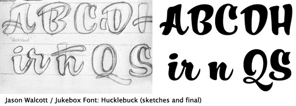
I went to school for art and graphic design. I graduated in 1997 from Kean College of New Jersey (now Kean University) with a BFA in Illustration. I worked a number of freelance and part time graphic jobs before designing my first typeface on a whim in 2000. That font was called “Holiday Times” (which is still part of the Jukebox collection – see next paragraph). It is based on the handlettered titles from the old Rankin Bass Christmas specials. After designing several more typefaces in 2000 and 2001, I finally released them for sale at MyFonts.com in summer of 2001.
In 2003 I was contacted by Veer as they were interested in carrying my designs. I gave them exclusive rights to the fonts and we relaunched as Jukebox in June of 2003. Pretty much everything I learned about how to design typefaces has been self-taught. Looking back at those early fonts now, there are things I should have done very differently, but that’s part of growing as a creative person. It takes time to hone your skills and reach certain level of comfort.
What’s your best selling typeface?
My bestselling typeface of all time has been “Stephanie Marie” which was released in May of 2004. While overall sales have dropped due to the poor economy, Stephanie Marie continues to be a strong seller. In fact it was the top selling typeface at all of Veer for November 2004.

Have you seen your work used anywhere famous or in mainstream media?
Yes! This is hands down one of the most fun aspects of my work. Since I don’t know who is purchasing the typefaces, when I see them out in the world it is always a nice surprise. I have seen Jukebox fonts on many well known products and publications. As far as famous goes, the best ones to top the list would be the following:
“Baileywick Curly” appeared on all the “signage” for the North Pole sets in the film “The Santa Clause 3” starring Tim Allen.
“Kitti Casual” appeared on all the DVD menus for the 2008 Platinum Edition release of Disney’s “101 Dalmatians” (the original 1961 animated feature).
“Alpengeist” was used on all of the store signage for Target Stores for their 2009 Halloween season. I’m talking about the big 3 x 4 signs that hang from the ceiling. This means those signs hung in every Target in the USA!
“Scriptorama Hostess” was used on the cover of Michael Bublé’s 2007 Christmas album entitled “Let It Snow”.
“Fenway Park” and “Andantino” were both used in the opening credits of the 2006 film “Thank You For Smoking” directed by Jason Reitman.
From 2004-2008 “Scriptorama Tradeshow” was used on the main building sign for The Viper Room club in West Hollywood.

I’ve also seen my fonts used in magazines, bookcovers, Disneyland park merchandise, on HGTV and The Food Network, as well as many products and advertisements.

What are some of your favorite typefaces of yesterday? Today?
One of my all time favorite typefaces is the original Bookman Swash Italic (not the ITC version). My admiration is due not only to it’s unique design, but it was a very popular typeface in the 1970s when I was growing up, so there is a feeling of comforting nostalgia attached to it for me as well. I was quite thrilled to be able to breath new life into this font in the form of the “Jukebox Bookman” fonts which are a faithful digital revival of the original typefaces. There was an earlier digital version from a now defunct company, but it was hard to come by and not well executed.
Another of my favorite fonts of yesterday is the Avant Garde family. It is both retro and yet fresh and timeless. I admire the sleekness of its design and versatility. I also like Handel Gothic which has become somewhat of the quintessential Science Fiction font.

As far as current typefaces, I greatly admire the work of Alejandro Paul. He has designed some of the most elegant script faces to come out in the last 5 years. One of my other current favorites is the complete “Hoefler Text” family by Jonathan Hoefler. It’s not only beautiful, but technically flawless, and is a standard of design I can only hope to achieve.
What’s your favorite type of typeface: script? serif, etc?
My favorite classification is Script fonts. I think those are probably everybody’s favorite, because they have the most versatility and character. They can be both formal and elegant or fun and whimsical. They are also the most fun to design!
Any forecast for future trends or hot typefaces to look out for?
I think the advent of OpenType technology will continue to influence font design for a long time. I’ve noticed a trend in recent years toward typefaces with large sets of alternates, especially elaborate ligatures and swash variants. Because OpenType fonts can contain a virtually limitless number of glyphs, I think we will continue to see a movement toward digital type that loses it’s “computery” look and becomes much more organic as though it were hand lettered. As of early 2012, I have begun to develop a new library of fonts under the foundry name “CounterPoint“. I hope to have the first few designs available to the public by the end of the year.
Is there anything you try to avoid when developing or using typeface?
As far as designing fonts, I try to avoid anything that’s too clichéd or might be classified as “novelty” font. An example of this would be say, a font called “Bones” where the letters all looked like they were made of drawings of bones. Those types of fonts have very limited use. I’ve also avoided designing text faces. Most of the Jukebox library consists of display fonts, but I was determined to challenge myself to design a text face at least once.
The result was my “Empyrean” family. I was fairly pleased with the result, I learned a lot about type design, and I don’t ever want to do it again. Designing text faces is a whole different ball game because of the technical aspects involved. But I am glad I did it once.
As far as using fonts correctly, I’ve seen a lot of unfortunate missteps out in the world by others. Some examples that spring to mind are script fonts used as all caps, overuse of swash characters, and uncorrected kerning. In my own personal use of type, I would never use more than three different fonts in one design, but two would be preferable.
Are there any ‘go to’ typefaces that you think are versatile enough to use in almost any situation?
From my own Jukebox library, I would probably choose my “Eloquent” family to fit this bill. The Roman fonts are a digital revival of an old photo-typositing face called Pistilli Roman. I later expanded the family by designing the Italic faces to go with them. As far as traditional fonts, a good workhorse that can be used in almost any design is “Optima” by Hermann Zapf. It really is a beautiful design…The perfect marriage of serif and sans-serif typefaces, it has a quiet elegance.

Jason’s fonts are available on Veer.com under the font foundry name of Jukebox.
Splendor’s team recently visited Woodhaven’s lumberyard in Lakewood, New Jersey to document the magnitude of this 44-acre multifaceted operation.
read more
Your brand’s typography and image should be considered, especially on your website. Here are 8 specific typography traits that can impact your brand’s image!
read more
Typography can impact your business and overall brand image in various ways. Here’s 9 different areas to consider to make sure your typography is up to par!
read more